Artist Hero Post #1 :
Salvador Dali
"The difference between false memories and true ones is the same as for jewels: it is always the false ones that look the most real, the most brilliant."
~ Salvador Dali
Analysis of "Galatea of Spheres"
|
Description
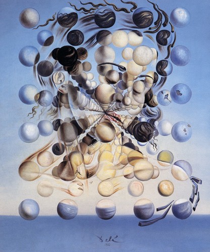
Salvador Dali's "Galatea of Spheres", completed in 1952, is a 65.0 by 54.0 cm oil on canvas painting depicting his wife, Gala. This additive work was inspired by scientific discoveries in atomic theory and his beloved wife. He recreated a bust of his wife by using atomic like orbs. The title, "Galatea of Spheres", references the Greek mythological sea-nymph who the fairest and most beloved of the sea-nymphs. Galatea's influence in this painting is recognizable in the seascape setting. Interpretation
"Galatea of Spheres" is an abstract piece that depicts Dali's wife through the use of spheres, colors, and lines. The expression she wears gives the painting the feeling that she is important and a figure to be respected. I get a peaceful vibe from the colors and expression on her face. The background is reminiscent of the ocean on a cloudless blue day and is set in a surreal space, where Dali's wife is the focus. His purpose was to idolize his wife and portray his love for her by showing off her beauty and importance to him. Judgment
I like this piece because of the interesting use of spheres and radial balance to create the human form. The colors and movement lines are very appealing to the eye. The title, "Galatea of Spheres" makes sense with the purpose of the piece because Galatea was a Greek mythological sea nymph who was known for her beauty. By comparing his wife with Galatea, Dali was saying his wife's beauty was so great that it could only be compared to a fictional being. |
Analysis
Dali manipulates line to suggest movement in the spheres and bring energy in the piece. Line is evident in the sphere to reference hair and color bones of the woman. Color is used to show differences in facial features like the skin and hair from the blue background. Shape is used in the circles which creates a rectangular "frame"around the woman. The spheres form a three dimensional aspect to the painting by using lighting to show its round shape. Texture is evident in the brown squiggles that read as hair. The shine on in the curls suggests its wavy, soft texture. Salvador Dali makes the spheres feel like they're in a different plane from the background which feels simple and flat. Unity and variety are definitely used in this piece to arrange the spheres to make the woman visible. The movement lines and spheres also work to form the woman. There is a sense of radial balance originating from the center of the painting outwards. Since the point of radiation is the center, there is also symmetrical balance in the spheres, forming a rectangle. Emphasis in the painting is on the woman because she is the most vibrant point and also three dimensional which contrasts with the two dimensional background. The spheres take up the most space in the piece, giving the viewer the impression that she is the dominant figure. Compared to the background, she is unrealistically large and floating in space, independent of the background. |
Artist Hero Post #2 :
René Magritte
Analysis of "The Son of Man"
|
Description
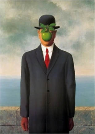
"Son of Man" is a 45.67 in × 35 inches oil on canvas painting made by French artist, René Magritte. It is a self portrait made in 1964 set near the sea on a cloudy day. There is an apple impossibly floating in front of the man's face, while the man stands straight up. Interpretation
This is a surrealist piece that evokes an uneasy feeling. It causes questions like why is this man here? He looks out of place and why is he staring straight at the observer? The mood is quizzical and dark because the sky looks angry and the man's expression is hidden behind the apple. This seems to be a piece about repression. The background shows human repression of nature because the man made wall blocks the man from the ocean. But at the same time the man is being repressed by the apple, who hides his face causing the observer to not know this man. You can't identify him or recognize any details in his face or expression, the apple takes that away from him. The way the man is dressed reminds me of a business man in the mid-nineteenth century. This is significant because this time period is after the industrial revolution, which devastated the natural world. I think the artists purpose for "The Son of Man" was to make a statement about the barriers humans put up to control nature, but it's all for naught because nature will always get the better of humanity. Judgment
I enjoy this piece because it makes me think and try to understand René's point in making it. René's art and this work inspired Andy Warhol and the pop art movement. The title, "The Son of Man" works well with the piece because an apple is a motif of the bible story of Adam and Eve, representing temptation. René said that the apple is supposed to evoke an interest in what it is covering. He made a statement that humans want to know what is hidden behind the "visible". The apple causes the human temptation to see what its covering which aligns with Adam and Eve eating the forbidden fruit. |
Analysis
The most prominent elements of design are color, value, shape, and form. The color and value differences help distinguish the background from the man. The use of complementary colors in the man's red tie and the bright green apple help the apple pop and show that it is the focus of the piece. Shape and form work together to create the feel that there is a three dimensional man standing next to a wall of blocks near the ocean. Light and shading in the painting is evident in the apple and the man's clothing. Space is used to make the man appear large and the central component of the piece, compared to the background and wall which seem much smaller and muted. The apple looks smooth, the man's clothes looks real, and the rock wall looks hard and rough. This is accomplished with René's use of texture. Line used in this artwork is mostly organic besides the straight lines of the rock wall and the flat ocean line in the background. The man is standing in the direct center of the canvas and the apple is in the center of his face causing symmetry. Emphasis is used to focus on the apple through the use of contrasting colors and placement over the man's face, creating a power dynamic. There isn't really any movement in the painting, it looks consistently static. Unity and harmony join the piece together to make it cohesive. The light source coming from the top left of the painting is consistent on the man, the apple, and the background which makes the painting convincing and realistic. The shiny apple texture and the man's coat texture contrast with each other to emphasis the importance of the apple. Variety in realism is exemplified in this painting because the man, the apple, and the background are realistic throughout, except the apple is being impossibly suspended over the man's face. |
Artist Hero Post #3 :
Anselm Kiefer
Analysis of "Osiris and Isis"
|
Description
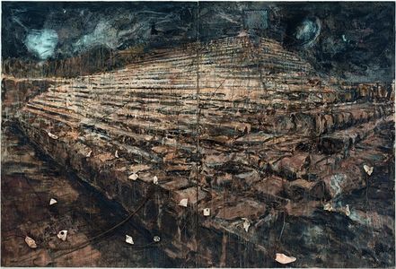
"Osiris and Isis " is an oil painting with pieces of porcelain created from 1985-1987 by Anselm Kiefer. Its dimensions are 149 1/2 x 221 x 9 1/2 in. This work depicts the ancient Egyptian story of the god, Osiris and his wife, Isis. As the story goes, Osiris is captured in a sarcophagus by a jealous god and thrown into the Nile. His body is then scattered in pieces across Egypt and Isis sets out to find all of them and bring Osiris back to life. Though the time Isis can bring Osiris back to life is short, she ends up having their son, Horus. The painting depicts this because it is set in Egypt, as told by the huge pyramid and the scattered porcelain pieces represent Osiris' scattered body. Interpretation
When I first looked at "Osiris and Isis" it felt ominous and looming, in its composition and color scheme. The crease down the middle of the canvas reminds me of a book telling the story of Osiris and Isis. Contrasting the looming pyramid and harsh terrain, the sky looks mystical and otherworldly. The piece seems to evoke an outlandish feel, like the viewer is an outsider to the world depicted in the painting. The porcelain pieces seem to depict Osiris' broken body that was scattered across Egypt. The sky looks a bit angry, maybe to portray the loss of the god Osiris after his murder. The pyramid symbolized not just Egypt itself, but the afterlife, which Isis feared Osiris couldn't get into because he was denied a proper burial ceremony. Anselm Kiefer's purpose in depicting a visual representation of this ancient Egyptian story could have been to show love and commitment that Isis had to try to bring her husband to life. Since the painting is pretty gloomy, it could show the struggles of Isis' love for Osiris and the burden she carries because of her devotion to him. Judgment
I chose this artwork to analyze because it stood out to me. I enjoy its olden and chaotic look. The title definitely makes sense with the piece because it is depicting the story of the people named in the title. Without the title, I wouldn't have known the mythology behind the piece and the meaning that it shows. |
Analysis
The line-work in the piece contributes to give the pyramid feel and a unique angle on the pyramid. It is consistently uneven lines which gives the work a hectic and old feeling to it. The ground and pyramid are the color of sand and pretty drab compared to the dark, ominous sky. The sky has lighter section which are reminiscent of space and stars, perhaps to honor the Osiris constellation. Shape and texture mostly apply to the pyramid, making life-like and remind the viewer of ancient pyramids. The porcelain pieces give the piece a three dimensional aspect, and pops out compared to the rest of the painting, which showcases Kiefer's use of space. Kiefer's tactic of making the piece look worn and aged through the color and inconsistent lines create unity and combine the porcelain pieces in the piece nicely, they don't look out of place. The different mediums create variety in the piece and contributes to the piece by giving individual importance to every aspect of the painting to make it a cohesive work. Since Kiefer took a unique perspective on the pyramid, looking not at the front but offset, at the corner of it, causes the painting to be asymmetrical and slightly distorted. At this angle, the viewer can tell that the pyramid is not straight but is worn away by the years. Emphasis in the piece seems to be geared towards the ceramic pieces that are the lightest part of the work and are three dimensional compared to the painting. The wrinkles and stray lines throughout the piece create a sense of environmental movement around the pyramid that causes it to become so weathered. The scattered pieces also add an element of random movement and unpredictability. Lastly, contrast is evident in this painting between the warm colors of the pyramid's yellowy-oranges to the sky's bluish-greens. |
